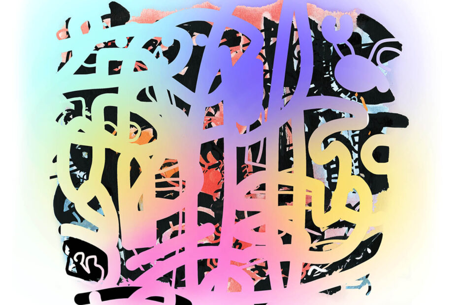
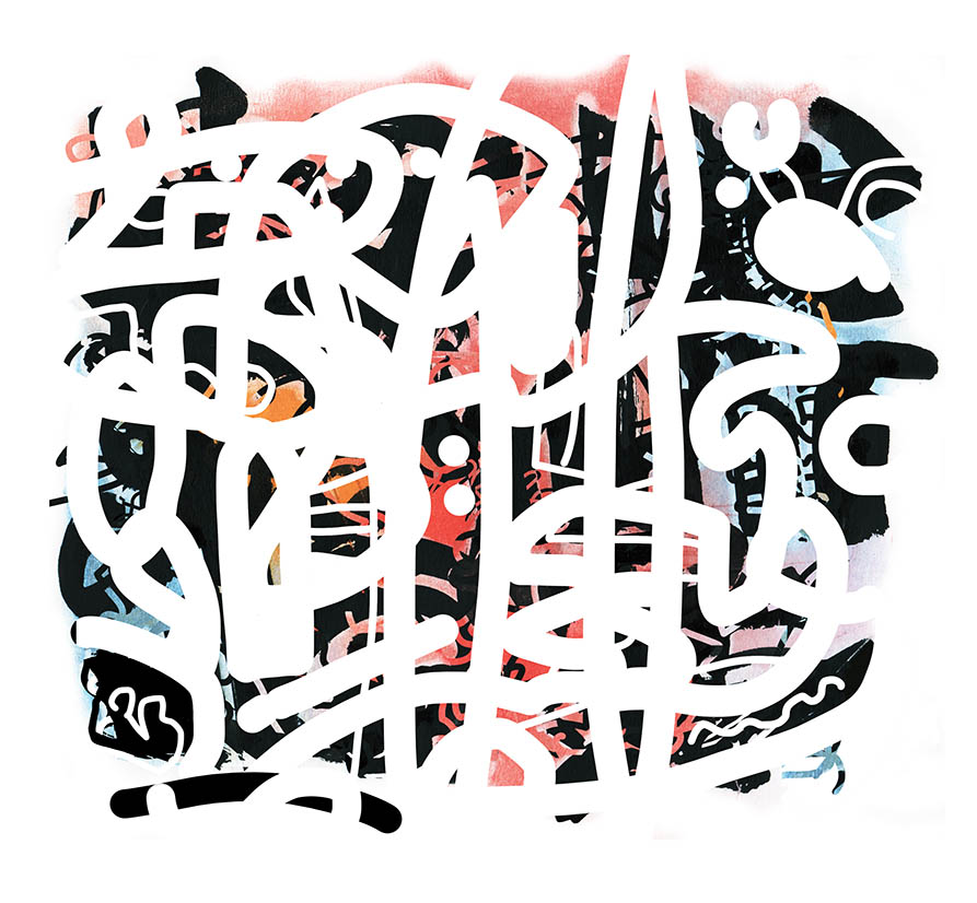
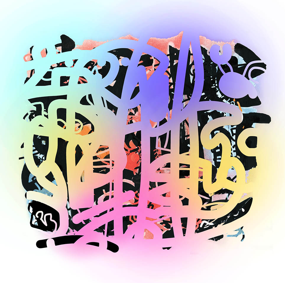
The work on the left comes from a place of ‘letting go’ of what I was working on using the image of the garden in Seville. Up till now, in my personal work – I have loved black or very dark colours as a very graphic statement, overlaying blocks of colour, allowing only tiny sections or scratches to push through. I unconsciously used a white brush (in Photoshop) to draw on top of an existing scanned acrylic Seville image and am surprised by the result. It feels like a ‘pushing-aside’ of darkness.
Spraying the white line with a colour I realised it reminded me of the light shining through a stained glass window at the Alhambra so I used the colours of that to finish the piece. A friend who reads Arabic tells me that at first glance it looks like Arabic writing and I suppose it could be my way of attempting to capture the visual beauty of that calligraphy and what I see, although what I was consciously doing was drawing the garden. More than anything, it feels like the joy of light.
Yes, some of your first pieces, I ever saw had this darkness that I felt very interested in.
It’s a surprise to feel excited by white! I must explore the Yin and Yang of that. Thanks for your comment.
It’s nice to see the light versions and I like the bold lines that you’re using too.. the previous ones are lovely too
Great to have your positive comments, thank you, I’m always open to observations.